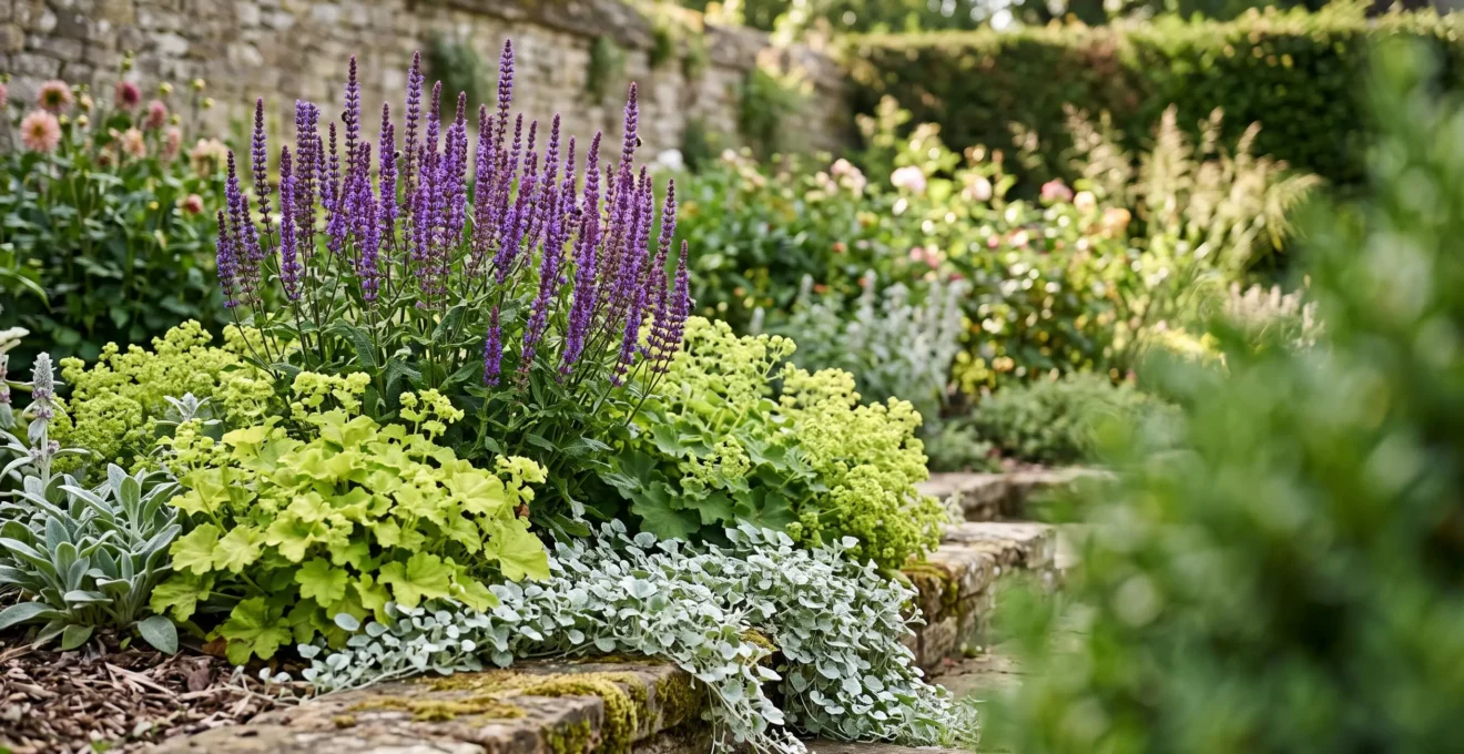
Contrary to popular belief, the ‘Thriller, Filler, Spiller’ rule is not just a simple recipe for containers; it’s a sophisticated compositional framework for creating dramatic visual contrast in any garden border.
- Effective contrast is built on a painterly understanding of color, form, and texture to create visual weight and guide the eye.
- Mastering simple principles like complementary colors, form repetition, and bloom synchronization transforms a flat design into a dynamic one.
Recommendation: Stop randomly placing plants and start thinking like an artist, using the ‘Thriller, Filler, Spiller’ concept to establish a clear focal hierarchy in your borders.
As a budding garden designer, you’ve likely felt the frustration. You choose beautiful plants, you place them in the ground, and yet the result feels… flat. The border lacks punch, the composition looks muddled, and it fails to capture the eye. Many guides will tell you the answer lies in the “Thriller, Filler, Spiller” method, a well-known technique for designing container gardens. It suggests a tall, dramatic plant (the Thriller), mounding plants to fill the space (the Fillers), and cascading plants to soften the edges (the Spillers).
While this is sound advice, its common application barely scratches the surface. The real power of this rule isn’t as a rigid formula, but as a mental model for creating artistic composition. The true secret to a dynamic border isn’t just mixing heights; it’s about deliberately engineering visual contrast through a painterly understanding of color, form, and texture. It’s about learning to control the ‘visual weight’ of each plant to create tension, rhythm, and a clear focal point.
But what if the key wasn’t just following the recipe, but understanding the artistic principles that make it work? This guide will deconstruct the ‘Thriller, Filler, Spiller’ concept and reframe it as a powerful tool for border design. We will move beyond the basics and explore how to use contrast not just as decoration, but as the fundamental structural element that gives a garden its life and drama.
This article will guide you through the core artistic principles that turn a simple planting into a compelling garden scene. Explore the sections below to master each element of contrast.
Summary: A Painter’s Guide to High-Contrast Borders
- Complementary Colours: Why Purple and Yellow Pop More Than Red and Pink?
- Spiky vs Round: Creating Contrast Without Colour?
- The ‘Polka Dot’ Mistake: Why Too Much Contrast Looks Messy?
- Black Grasses and Silver Foliage: The Ultimate Modern Contrast?
- Synchronization: How to Ensure Your Contrast Plants Bloom Together?
- Velvet vs Glossy: Pairing Leaf Textures in Herbaceous Borders
- White or Gold: Which Variegation Stands Out Best in Twilight?
- Using Vibrant Variegated Foliage to Light Up North-Facing Gardens
Complementary Colours: Why Purple and Yellow Pop More Than Red and Pink?
The most immediate tool for creating contrast is color, but not all pairings are created equal. While a border of red and pink flowers might seem vibrant, it can often blend into a soft, analogous wash. True, high-impact contrast comes from understanding the color wheel. As a designer, you must think like a painter and use colors that actively oppose each other to create energy. This is the power of complementary colors—pairs that sit directly opposite one another on the color wheel, such as purple and yellow, or blue and orange.
The science behind this is simple yet profound. When placed next to each other, these colors intensify one another, making each appear more vibrant and saturated. This isn’t just an opinion; it’s a principle of visual perception. The University of Georgia’s CAES Field Report clarifies this dynamic perfectly:
on the color wheel purple and yellow are opposite each other. Both colors complement each other and make the brightness of the other increase. Purple and yellow is a popular combination because the colors accent one another and make each other stand out
– CAES Field Report, Landscape Basics: Color Theory, University of Georgia Extension
Think of a drift of golden Black-Eyed Susans (Rudbeckia) punctuated by the intense violet-blue spires of Salvia ‘May Night’. The yellow makes the purple seem deeper and richer, while the purple makes the yellow positively glow. This is the compositional tension that elevates a design from merely ‘pretty’ to ‘unforgettable’. Your ‘Thriller’ plant might be a bold yellow, while the ‘Fillers’ are a sea of complementary purple, creating a powerful focal hierarchy.
Action Plan: Applying Complementary Colour Theory
- Identify Your Dominant and Accent: Choose one dominant color for your border and find its direct opposite on the color wheel. This opposing color will be your high-impact accent.
- Select Plants by Palette: Collect a list of plants, focusing first on those that feature your two complementary colors in their flowers or foliage. A purple-leaved Heuchera can be just as effective as a purple flower.
- Incorporate Diverse Shades: Use your two primary colors as a guide, but weave in a variety of lighter and darker shades of each. This adds depth and prevents the scheme from feeling like a simple checkerboard.
- Use Neutrals for Rest: Strategically add plants with green, grey, or white foliage. These neutrals act as a canvas, giving the eye a place to rest and making the complementary pairing even more dramatic when it appears.
Spiky vs Round: Creating Contrast Without Colour?
While color provides instant impact, a truly sophisticated border relies on a deeper layer of contrast: form. An entire garden planted in shades of green can be breathtakingly beautiful if it masterfully plays with the shapes and silhouettes of its plants. This is where the ‘Thriller, Filler, Spiller’ concept truly shines as a model for creating structural interest. The core principle is to create compositional tension by pairing opposing forms, most classically the vertical, spiky ‘Thriller’ against the soft, mounding ‘Filler’.
This contrast of form is what gives a border its rhythm and structure. The bold, sword-like leaves of an Iris or a Red Hot Poker (Kniphofia) create a strong vertical accent that draws the eye upward. When this is set against a soft, rounded mass of Geranium or Lady’s Mantle (Alchemilla mollis), the shapes define each other. The space between them, the negative space, becomes an active part of the design, carving out silhouettes and preventing the border from becoming a single, homogenous mass.
As the image above demonstrates, the rigid, vertical form of the iris gains its dramatic power from the soft, solid mound it emerges from. Without the round shape to play against, its spikiness would be lost. This is a fundamental lesson in visual design: a shape is only as strong as the contrast that defines it. Use tall, spiky grasses like Calamagrostis ‘Karl Foerster’ as your Thrillers, then surround their base with the soft, rounded forms of Heuchera or low-growing Sedum to create this powerful dialogue of shapes.
The ‘Polka Dot’ Mistake: Why Too Much Contrast Looks Messy?
As a new designer, once you discover the power of contrast, it’s tempting to use it everywhere. A yellow flower here, a purple one there, a spiky plant next to a round one, creating a confetti of interesting elements. This is the classic ‘polka dot’ effect, and it’s a recipe for visual chaos. A successful border needs a balance between excitement (contrast) and harmony (unity). Without unity, the eye has nowhere to rest, and the composition falls apart. The key to achieving this balance is repetition.
By repeating a specific color, form, or texture in several places throughout the border, you create a visual rhythm that ties the whole composition together. This doesn’t mean planting in rigid, symmetrical lines. Instead, weave drifts of the same plant or color through the border to lead the eye naturally from one point to the next. As the New York Botanical Garden’s research guide wisely states, this is a non-negotiable rule for a cohesive design. In their guide on color theory, they emphasize you must “remember the rule of repetition. A design will look too busy unless you repeat colors and shapes throughout the composition.”
A simple, structured way to apply this is the 60-30-10 rule, a classic interior design principle that works beautifully in the garden. This provides a clear framework for balancing your plant choices:
- 60% Dominant Plant/Color: This is the backbone of your border, often the green foliage that provides a calm, unifying canvas. This is your primary ‘Filler’.
- 30% Secondary Color/Form: These are your secondary ‘Fillers’ or softer ‘Thrillers’. They provide the main interest and are repeated in substantial drifts.
- 10% Accent Color/Form: This is your ‘look at me!’ element. It’s your boldest ‘Thriller’, a splash of a complementary color or a dramatic, contrasting shape, used sparingly for maximum impact.
This framework prevents the ‘polka dot’ mistake by ensuring your contrast is intentional and grounded in a unified, harmonious structure.
Black Grasses and Silver Foliage: The Ultimate Modern Contrast?
For a truly sophisticated and modern aesthetic, designers often move beyond the bright hues of the color wheel and into the dramatic world of achromatic contrast. The pairing of near-black foliage with shimmering silver leaves is the epitome of this style. This isn’t just about light versus dark; it’s about playing with visual weight and how plants interact with light to create a sleek, contemporary mood.
Plants with dark purple or black foliage, like Black Mondo Grass (Ophiopogon planiscapus ‘Nigrescens’) or certain varieties of Heuchera, have a high visual weight. They feel dense, absorb light, and tend to recede into the background, creating a sense of depth and mystery. They are the perfect ‘moody filler’ or a subtle, grounding ‘thriller’. In stark contrast, plants with silver or white foliage, such as Lamb’s Ear (Stachys byzantina) or Artemisia ‘Silver Mound’, have a low visual weight. They reflect light, appear to float, and advance towards the viewer, brightening any space they occupy.
When you pair these two, you create a powerful visual dynamic. The silver foliage seems to glow even more brightly against the dark, velvety backdrop of the black leaves. This pairing is particularly effective in modern or minimalist garden designs where structure and form are paramount. Imagine a river of silver Stachys flowing around a dark, architectural Phormium. The contrast is both dramatic and refined, proving that the most powerful statements are sometimes made without a single bright color.
Synchronization: How to Ensure Your Contrast Plants Bloom Together?
You’ve done everything right. You’ve chosen a stunning purple Allium as your ‘Thriller’ and a vibrant chartreuse Lady’s Mantle as your ‘Filler’. The color contrast is perfect on paper. But when spring arrives, the Alliums bloom and fade before the Lady’s Mantle even thinks about sending up its frothy flowers. The intended contrast never materializes. This is one of the most common and frustrating mistakes for a beginner designer: a failure to synchronize bloom times.
A beautiful composition is a fleeting moment in time. For your carefully planned contrasts to work, the key elements must be present on stage at the same time. This requires a bit of research, but it’s a non-negotiable step in the design process. Before you purchase any plant, you must check its tag or research its bloom period. Pay close attention to terms like “early spring,” “mid-summer,” or “late autumn” bloomer. The goal is to create pairings that share the same window of performance.
As the New York Botanical Garden advises, this planning is fundamental to success. Their guidance is direct and clear: “Make sure that plants intended to complement each other flower at the same time.” This principle extends beyond flowers. If you are contrasting the deep burgundy foliage of a ‘Diabolo’ Ninebark (Physocarpus opulifolius) with the bright gold of a ‘Goldflame’ Spirea, you need to ensure both hold their color throughout the same season. A successful garden design is a choreographed performance, and the designer’s job is to ensure all the actors show up for their scenes together.
Velvet vs Glossy: Pairing Leaf Textures in Herbaceous Borders
The final layer of contrast, and arguably the most subtle and rewarding, is texture. While color and form create drama from a distance, texture invites close inspection and adds a rich, sensory dimension to your border. A planting can be entirely one color, but if it pairs different leaf surfaces, it will be full of life and interest. The most classic and effective textural contrast is pairing a soft, matte, or “velvet” leaf with a hard, shiny, “glossy” one.
These opposing surfaces play with light in completely different ways. A fuzzy, silver leaf like that of Lamb’s Ear (Stachys byzantina) has a matte surface covered in tiny hairs. This texture diffuses light, giving the plant a soft, gentle glow. It begs to be touched. In contrast, a waxy, glossy leaf, like that of a Bergenia or a Hart’s Tongue Fern (Asplenium scolopendrium), has a smooth, reflective surface. It bounces light back at the viewer, creating sharp highlights and a sense of crispness and moisture.
When you place these two textures side-by-side, as seen in the close-up above, the effect is captivating. The softness of the velvety leaf is amplified by the hardness of the glossy one, and vice versa. This is a detail that might be missed from across the lawn, but it is what makes a border compelling up close. It is the secret that turns a collection of plants into a rich tapestry. Use these pairings along the front of a border or near a pathway where they can be truly appreciated.
White or Gold: Which Variegation Stands Out Best in Twilight?
Variegated foliage is a designer’s secret weapon for adding light and interest, but not all variegation performs the same way, especially in the low light of dawn and dusk. Have you ever noticed how plants with white or silver markings seem to magically glow in the twilight, while those with yellow or gold variegation fade into the shadows? This isn’t your imagination; it’s a fascinating quirk of human vision.
This phenomenon is explained by a well-documented optical phenomenon called the Purkinje effect. As daylight fades and our eyes transition from using cone cells (for color vision) to rod cells (for low-light vision), our peak color sensitivity shifts. We become less sensitive to colors on the red-yellow end of the spectrum and more sensitive to the blue-green end. The effect is named after the Czech anatomist Jan Evangelista Purkyne, who first described it in 1819 during his early morning walks.
For a garden designer, this has a profound practical application. If you are designing a “moon garden” or a space that will be enjoyed primarily in the evening, white and silver variegation is vastly superior. Plants like Variegated Japanese Sedge (Carex morrowii ‘Ice Dance’) or the silver-splashed leaves of a Brunnera ‘Jack Frost’ will catch the last rays of light and appear luminous. In contrast, a golden-leaved Hosta or a yellow-variegated Euonymus will lose its punch and recede into the gloom. Understanding this scientific principle allows you to choose plants that will perform exactly when you want them to.
Key Takeaways
- The ‘Thriller, Filler, Spiller’ rule is a compositional framework for creating visual hierarchy, not just a recipe for pots.
- True contrast comes from the deliberate pairing of opposites: complementary colors, spiky vs. round forms, and matte vs. glossy textures.
- Unity is as important as contrast. Use repetition and the 60-30-10 rule to prevent a design from looking messy and chaotic.
Using Vibrant Variegated Foliage to Light Up North-Facing Gardens
One of the most common challenges in garden design is the dreaded north-facing wall or the space beneath a dense tree canopy. These shady spots can feel dark, gloomy, and difficult to plant. While many assume these areas are doomed to be boring, a strategic use of contrast can transform them into luminous, engaging features. The key is not to fight the shade, but to work with it by choosing plants that reflect and amplify what little light is available.
This is where foliage with white, cream, silver, or chartreuse variegation becomes an invaluable tool. These light colors act like mirrors in the garden, catching and bouncing light around, creating the illusion of brightness. As the New York Botanical Garden’s guide explains, this is a fundamental principle of designing for low-light conditions: “Pale colors, yellows and white reflect light and illuminate shady spots.” A large-leaved Hosta with a wide, creamy-white margin, like ‘Patriot’, can have the impact of a spotlight in a dark corner.
By applying the ‘Thriller, Filler, Spiller’ framework here, you can create a dynamic, multi-layered composition entirely from foliage. Use a tall, arching Variegated Solomon’s Seal (Polygonatum odoratum ‘Variegatum’) as a ‘Thriller’, fill the space below with the bold, glowing leaves of Hosta ‘Guacamole’, and let the silvery-white Japanese Painted Fern (Athyrium niponicum ‘Pictum’) spill forward as your ‘Spiller’. The result is a sophisticated tapestry of light and texture that proves a garden doesn’t need full sun to be full of life and contrast.
By moving beyond a literal interpretation of ‘Thriller, Filler, Spiller’ and embracing these core principles of artistic contrast, you can begin to craft borders that are not just collections of plants, but dynamic and compelling compositions.